Paywall Redesign
Project Overview
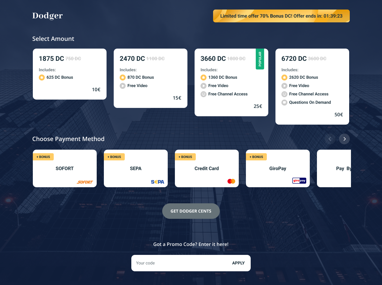
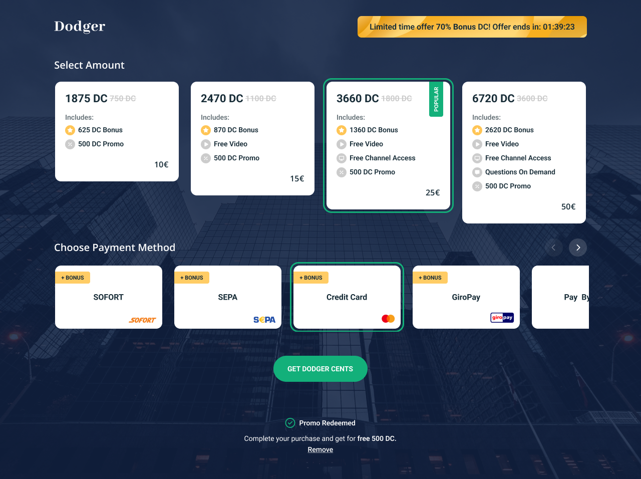
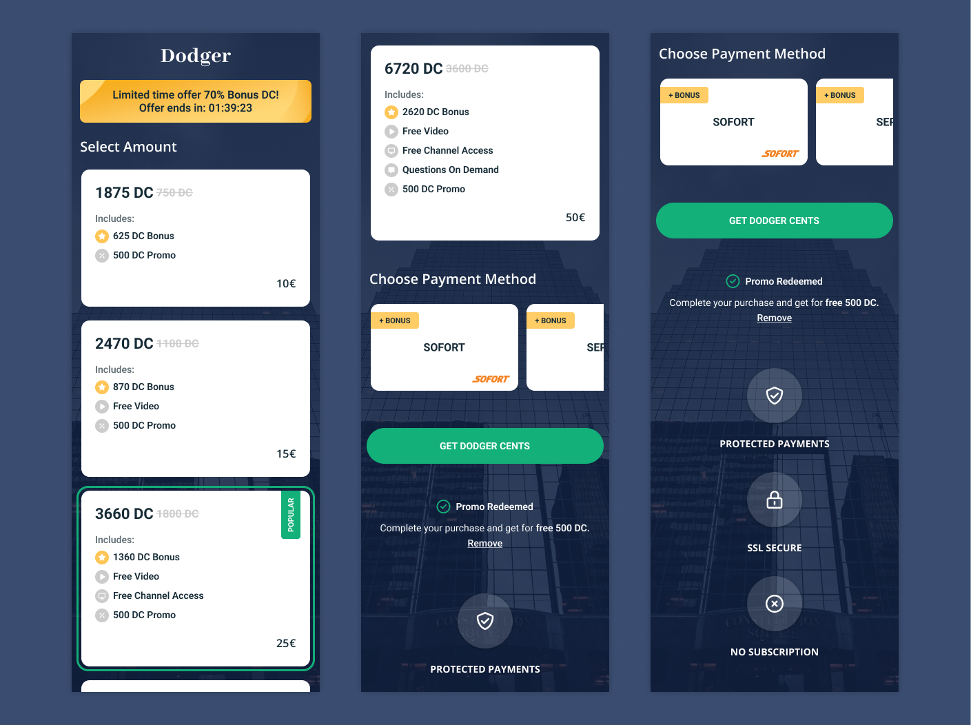
The paywall redesign aimed to create a seamless, flexible payment experience for new users, making it easier for them to unlock premium content. Users could choose from four pricing options—10, 15, 25, and 50 euros—each catering to different content access levels. With seven payment methods available, including credit card, phone payments, crypto, and bank transfer, the paywall offered a range of options to suit diverse user preferences. Additionally, we introduced a new feature for promo codes, allowing users to apply discounts easily.
Problem Statement
The previous paywall lacked flexibility, limiting users to fewer payment options and pricing tiers, which created a barrier to content access. Many users expressed frustration with the limited payment methods, and the absence of promo codes reduced the platform’s ability to offer targeted discounts. Our challenge was to design a versatile paywall that simplified the payment process, showcased all available options, and encouraged conversions.
User Research & Insights
To better understand user expectations, we conducted surveys and usability tests with both new and existing users. Feedback highlighted the need for more payment flexibility, as users frequently cited a preference for alternative payment methods like crypto or SEPA. Our research also underscored the appeal of promo codes, with users noting that they’d be more likely to subscribe if they could apply discounts.
User Personas
We developed personas to represent various types of new users, such as “Alex,” who prioritizes privacy and prefers crypto payments, and “Sophia,” who values simplicity and uses credit cards for online transactions. This helped us ensure that the redesigned paywall addressed the diverse needs of our audience, providing an inclusive experience that suited each persona’s preferences.
Design Strategy & Goals
Our design strategy aimed to create a straightforward and accessible paywall. Key goals included displaying pricing options in a clear, user-friendly format, prominently featuring all payment methods, and introducing an intuitive promo code field. The design emphasized transparency around payment terms and simplified the user journey, from selecting a pricing option to completing the payment.
Screens
User Testing & Iterations
User testing provided valuable insights, particularly around the ease of selecting payment methods and applying promo codes. Feedback indicated some users initially overlooked the promo code field, so we adjusted the layout to make it more prominent. Additional iterations focused on refining icon design for lesser-known payment options like SEPA and Sofort to ensure users could confidently choose their preferred method.
Outcome & Impact
The redesigned paywall resulted in a 4% increase in new user conversions. Users appreciated the expanded payment options and the flexibility of promo codes, which boosted engagement during promotional campaigns. The platform also observed a positive response to the clear, accessible layout, with feedback noting the ease of navigating the payment process.