DESIGN SYSTEMS
Building complex design systems that drives efficiency, consistency, and inclusivity in the design process.
Building a Design System!
The Value of a Design System
In the world of UI/UX design, a design system is an invaluable toolkit that provides a unified approach to creating cohesive, intuitive, and scalable user interfaces. At its core, a design system is a comprehensive collection of reusable components, guided by clear standards and best practices, that can be assembled together to build any number of applications. This system ensures consistency across different platforms and devices.
One of the primary advantages of a design system is its ability to streamline the design and development process. By leveraging a standardized set of components, designers and developers can collaborate more effectively, reducing the time spent on redundant tasks and minimizing the risk of inconsistencies. This not only accelerates the production cycle but also enhances the quality of the user experience, as users will interact with a consistent and predictable interface, regardless of where they engage with your product.
A well-crafted design system fosters scalability and flexibility. As your product evolves, the design system can adapt and expand, accommodating new features and functionalities without compromising on visual and functional coherence. By providing a robust foundation, a design system enables teams to focus on innovation and user-centric improvements, rather than getting bogged down by design inconsistencies.
Design systems play a pivotal role in enhancing accessibility and inclusivity. By incorporating accessibility standards and best practices into the design system, you ensure that your product is usable by a diverse range of users, including those with disabilities.
In essence, a design system is more than just a collection of UI components; it is a strategic asset that drives efficiency, consistency, and inclusivity in the design process. By investing in a robust design system, you lay the groundwork for a scalable, adaptable, and user-centered product that can grow and evolve with your users' needs.
Familiar / Worked with
Material UI

Primevue
Tailwind Css
The Value of a Design System
Building a Design System!
Don't trust your eyes! What i have learned from my experience is that every style, element or component have a mathematical equation behind it. From the Fibonacci sequence to Tim Brown's modular scale our ancestors gave us all the tools to make a design look good and functional. Although i will not dive into details here is a small sample what to expect from me building a design system.
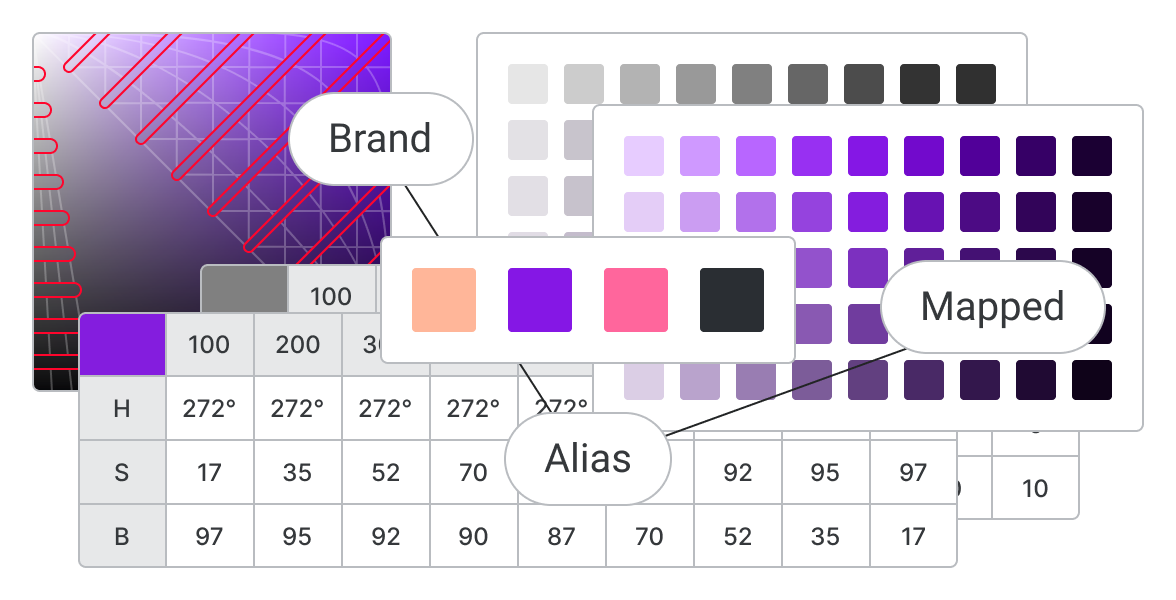
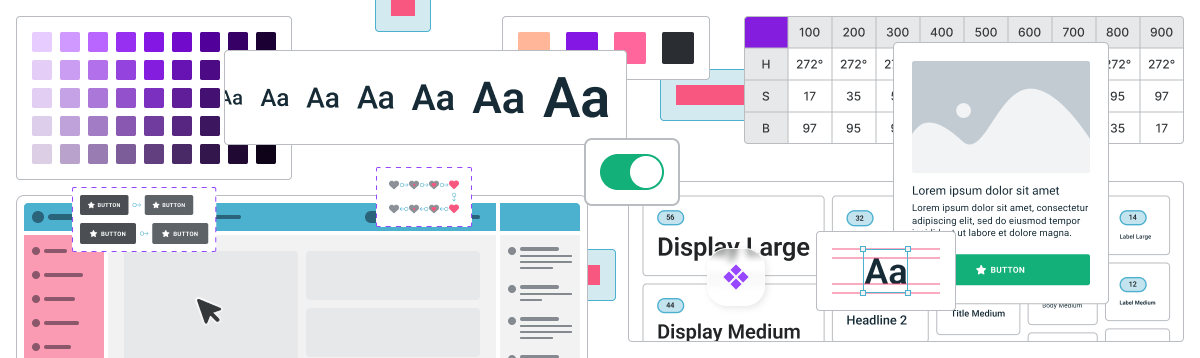
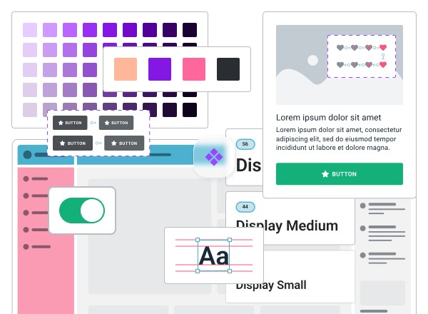
Color Styles
When building a color system in a design system, I always start with the companies brand colors as the foundation. Defining primary, secondary, tertiary, and neutral palettes and create aliases with descriptive names to clarify each color's role. Mapping these aliases to specific colors to ensure consistency across the design system, making it adaptable and cohesive.
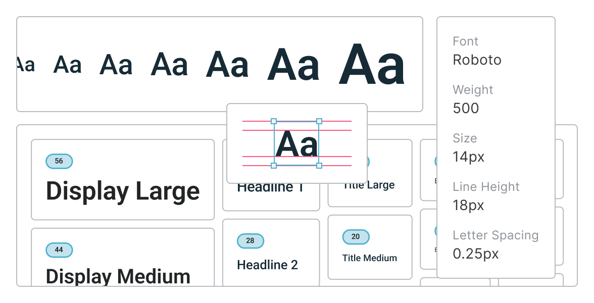
Type Scale
A well-defined type scale is crucial for creating a harmonious UI. Selecting a core font and establishing a range of sizes and weights to ensure readability and visual hierarchy. Naming type styles like "display," "heading," "title," "body," and "label" is essential to clearly define their roles in SEO. This approach helps create a balanced typography system across the design.
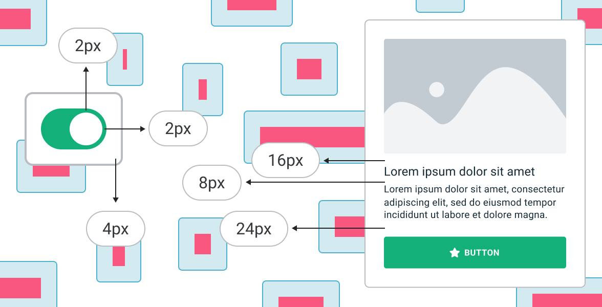
Spacing & Corner Radius
Using a 4px grid for spacing ensures consistency and alignment across all web designs, making layouts more cohesive and visually balanced. Applying this pixel grid to define corner radius, margins, padding and gaps between elements, creating a rhythm that guides the user's eye, reinforcing a unified look and feel throughout your design system. This approach simplifies scaling and maintains visual harmony.
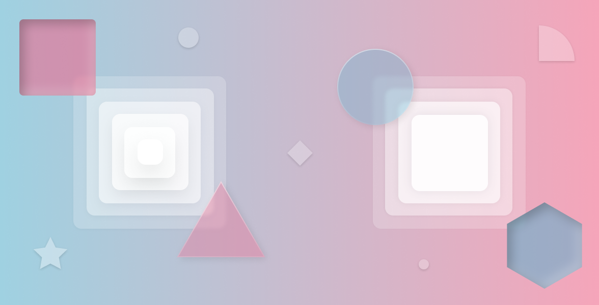
Shadows & Blurs
Shadows and blurs add depth and focus to a design, enhancing the user experience by creating a sense of hierarchy and interactivity. In a design system, I define a consistent range of shadows and blurs that vary in intensity to indicate elevation and importance. Keeping these effects subtle and purposeful, I ensure they align with the overall aesthetic and do not overwhelm the interface.
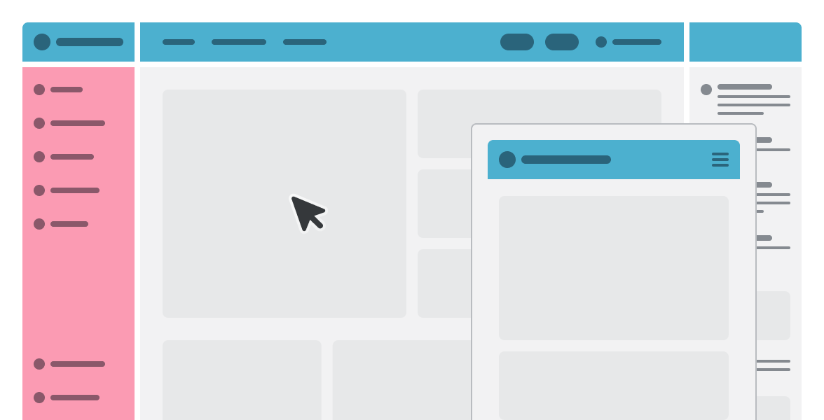
Layout
Layout is the backbone of an effective UI/UX design system. Organizing content in a way that's intuitive and easy to navigate, guiding users seamlessly through the interface. Aligning elements to ensure balance and visual coherence to defining margins, padding, and spacing to maintain uniformity. This structured approach to layout enhances usability and makes the design scalable, adaptable to various screen sizes and devices.
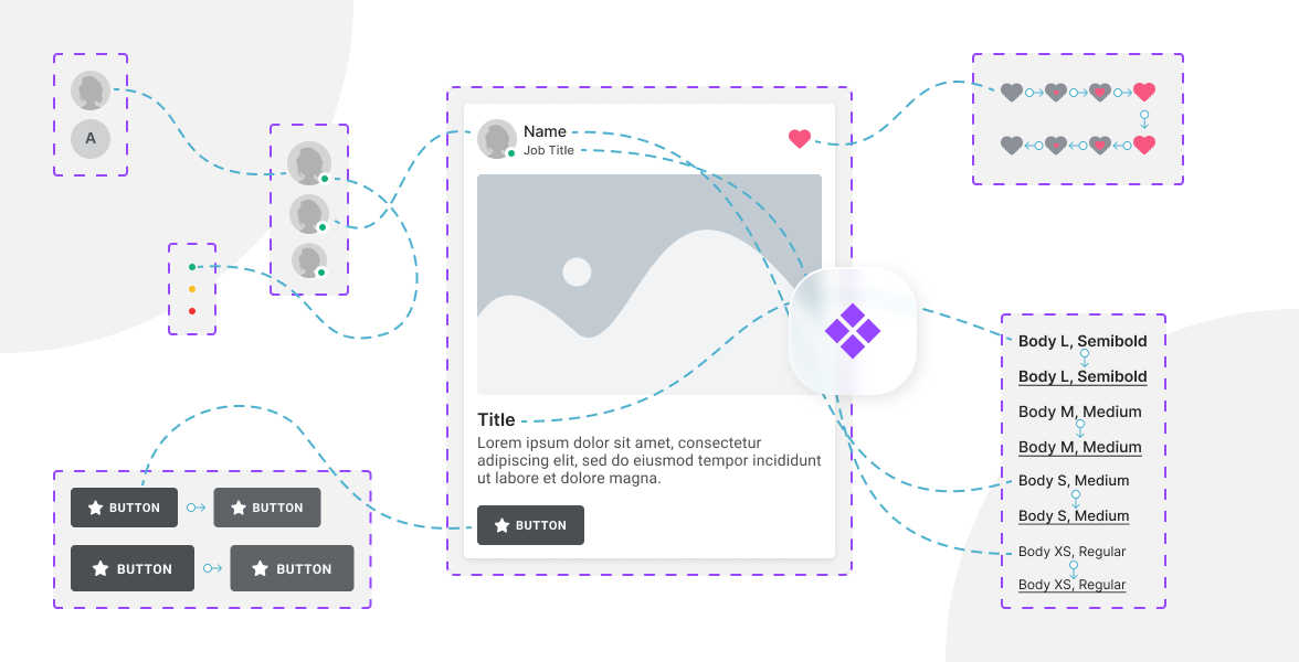
Components - Simple + Nested
Providing reusable elements that ensure consistency and efficiency. Simple components like buttons, inputs, and icons, which form the foundation of an interface, combined into nested components such as forms, cards, and modals, that encapsulate more complex functionality. By defining clear guidelines for how components should be used and combined, I create a cohesive design system that is flexible, scalable, and easy to maintain.