BRANDING & IDENTITY
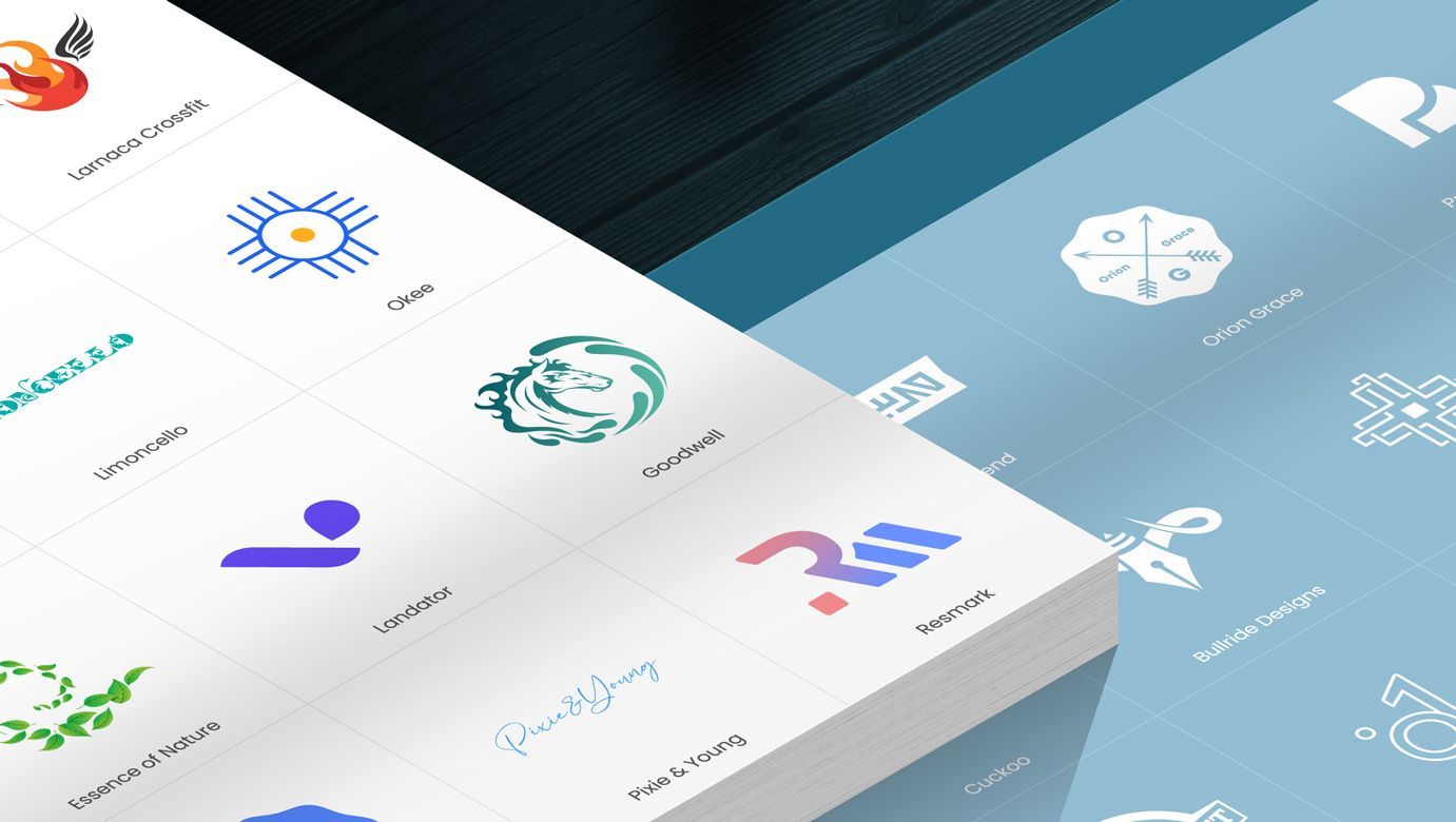
With a keen eye for visual aesthetics and a deep understanding of brand strategy, developed a cohesive and memorable brand identities for diverse clients. My skills encompass combining typography, color theory and brand guidelines, ensuring consistency across various touchpoints building strong brand identities that resonate with the target audience, leaving a lasting impression and fostering brand recognition.

Slide title
Button
Core Elements of a Powerful Brand Identity
Research & Inspiration
Uncovering Insights to Drive Design Direction
Design Execution
Turning Vision into Reality Through Design
Concept Development
Crafting the Blueprint of Your Brand Identity
Brand Guidelines
Ensuring Consistency Across All Touchpoints
Branding Philosophy
Designing with Purpose and Authenticity
Understanding the essence of a brand is where I begin each project. I delve into the client's industry, competitors, and target audience to gather key insights. This research phase is crucial for identifying design opportunities and ensuring that the final identity truly resonates with the intended market. I then curate a mood board that captures the visual direction, ensuring the design aligns with both current trends and the brand's unique personality.
Every great brand starts with a strong concept. I explore multiple ideas through sketching and brainstorming sessions, experimenting with various design directions to find the perfect representation of the brand. Whether it’s a logo or a complete identity system, I aim to create concepts that are not only visually appealing but also deeply connected to the brand’s core values.
With a solid concept in place, I move on to crafting the visual identity. Using tools like Adobe Illustrator and Figma, I refine the initial sketches into polished designs, focusing on elements such as logo, typography, and color palette. My goal is to create a cohesive visual language that not only looks great but also communicates the brand’s message effectively across all mediums.
Consistency is key to a successful brand, and that's where brand guidelines come in. I develop comprehensive guidelines that outline the proper use of logos, colors, typography, and other visual elements. These guidelines ensure that everyone involved in the brand’s communication—whether designers, marketers, or partners—can maintain a unified and professional appearance.
I believe that great branding is about more than just aesthetics—it’s about telling a compelling story. My approach is grounded in the idea that a brand’s identity should be authentic, resonant, and adaptable. I strive to create designs that not only capture the essence of a brand but also evolve with it, ensuring long-term relevance and impact.
A small example of Branding & Identity.
Landator
Project Overview
Design Execution
Logo Design & Symbolism
Typography & Tone
Application & Consistency
Landator is a dynamic platform focused on showcasing real estate properties for sale, catering to a broad spectrum of buyers—from first-time homeowners to seasoned real estate investors. As a brand, Landator needed a strong visual identity that communicated professionalism, trust, and modernity.
The logo design for Landator was built around the idea of clarity and simplicity, reflecting the brand's commitment to transparency and ease of use in the real estate market. The chosen symbol—a stylized, location icon—evokes the essence of quickly finding a property to the price and location of the customer. The typography complements this with a bold yet approachable Geometric sans serif typeface (Poppins), symbolizing the solid foundation that Landator provides for both buyers and sellers.
The color palette for Landator was crafted to reflect both the vibrancy of the real estate market and the professionalism that underpins the brand. The primary color, a bold #6D1DDE (deep violet), was chosen to represent innovation, creativity, and trustworthiness. Complementing this is #2B3233 (charcoal grey), a neutral, sophisticated tone used for text and other essential UI elements, providing a clean and professional backdrop.
To add balance and warmth, I introduced #FFDD32 (bright yellow), a vibrant accent color that evokes optimism and draws attention to key features without overwhelming the design. The inclusion of #0ACCCC (aqua) brings in a modern, refreshing feel, symbolizing growth and opportunity in the real estate market.
Together, these colors create a harmonious blend that conveys trust, clarity, and a forward-thinking approach.
To reinforce the brand’s modern, user-friendly appeal, I chose a sans serif typeface (Poppins) that balances professionalism with accessibility. This typeface not only ensures legibility across all digital platforms but also reflects the brand’s forward-thinking approach.
Brand consistency was a priority across all touchpoints—from the website interface to marketing collateral and social media presence. The design system I created ensures that Landator maintains a cohesive visual identity no matter the medium. The minimalistic and modern approach of the branding extended seamlessly into the UX/UI design, ensuring a smooth user experience aligned with the brand's core values of simplicity and trust.


