ICONOGRAPHY
Icons are a fundamental aspect of modern web design, serving as powerful tools to guide users, highlight features, and enhance overall usability.
Designing custom icons that are simple, easily recognizable and maintain a consistent style throughout the icon set.
Iconography plays a vital role in user interface (UI) design, serving as a visual language that enhances communication and usability. Icons are small graphical representations that symbolize actions, objects, or concepts, allowing users to quickly understand and navigate through an interface without relying heavily on text. When designed effectively, icons can significantly improve the user experience by making interfaces more intuitive, aesthetically pleasing, and efficient.
The primary benefit of using icons in UI design is their ability to convey complex information quickly and clearly. In a world where users seek instant understanding, well-designed icons can bridge language barriers and provide immediate recognition of functions or content. For instance, a magnifying glass icon universally represents a search function, while a gear icon typically denotes settings. These visual shortcuts help users perform tasks with minimal cognitive load, enhancing the overall efficiency and satisfaction of the user experience.
Iconography contributes to the aesthetic appeal and visual coherence of an interface. Consistent and well-crafted icons can create a unified look and feel, reinforcing the brand identity and contributing to a polished and professional appearance. The style, color, and size of icons should be carefully considered to ensure they align with the overall design language of the product. Whether opting for a minimalist, flat design or a more detailed, illustrative approach, maintaining consistency in iconography helps establish a harmonious and visually appealing interface.
Another critical aspect of iconography is its role in accessibility. Icons should be designed with inclusivity in mind, ensuring they are easily recognizable and understandable by all users, including those with visual impairments. Providing alternative text for icons and ensuring sufficient contrast are essential practices to enhance accessibility. Additionally, designers should consider cultural differences and avoid using symbols that might be interpreted differently across various regions. This thoughtful approach to icon design ensures that the interface is accessible and usable by a diverse audience.
The Role of Iconography in UI/UX
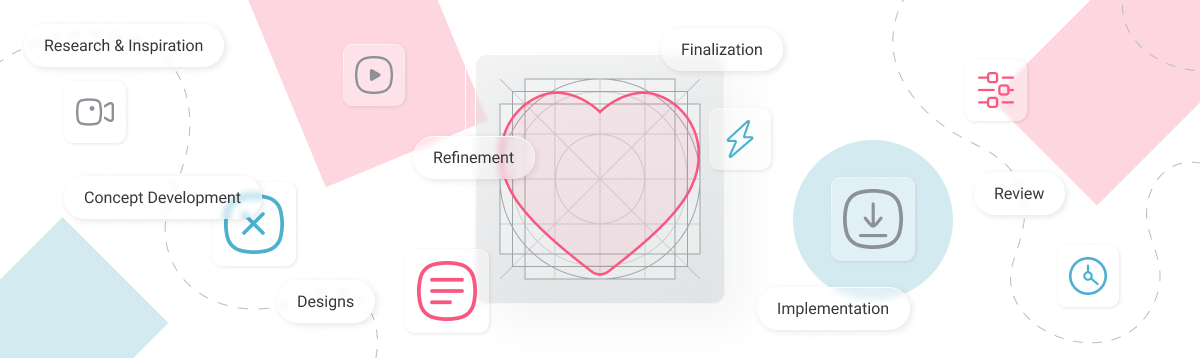
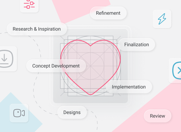
Creation Procedure
Research & Inspiration
Concept Development
Designing the Icon
Refinement
Implementation & Review
Finalization
- Understanding the purpose of the icon and the context in which it will be used. Who is the audience? What is the icon's function?
- Gather Inspiration: Researching existing icons, design trends, and styles that align with the project’s requirements.
- Mood board creation to visualize the direction taking.
- Sketching Ideas and rough sketches. Focusing on basic shapes and the overall silhouette of the icon.
- Exploring Variations: Experiment with multiple versions of the same icon to find the best representation.
- Choosing a style with consideration on the brand’s visual language and how the icon will fit in.
- Creating the icon with the use of vector-based software (like Adobe Illustrator or Figma).
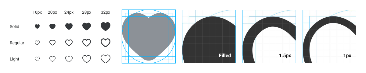
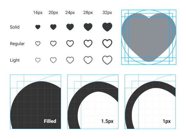
- Consistency: Ensuring that all icons share a consistent size, line weight, and style. This is crucial for maintaining a cohesive look.
- Feedback Loop: Sharing the designs with colleagues, clients, or stakeholders to gather feedback.
- Make necessary adjustments to the icon's proportions, balance, and alignment.
- Testing at Different Sizes: Icons often need to work at various sizes. Testing the icon at different resolutions to ensure it remains clear and recognizable.
- Applying color if needed, ensuring it aligns with the overall brand or design language. Adding finishing touches like shadows or gradients if they enhance the icon’s clarity or aesthetics.
- Exporting the icon in multiple formats (SVG, PNG, etc.) and sizes as required and ensuring that the files are optimized for web use.
- If part of a project, documenting the icon’s purpose, usage guidelines, and any variations. This ensures consistency when the icon is used across different platforms.
- Integration: Working with developers or the design team to integrate the icon into the website or app, ensuring that it works well in the intended environment.
- Review & Feedback: After implementation, reviewing the icon in its final context, making any last-minute tweaks if necessary and gather feedback for future improvement.